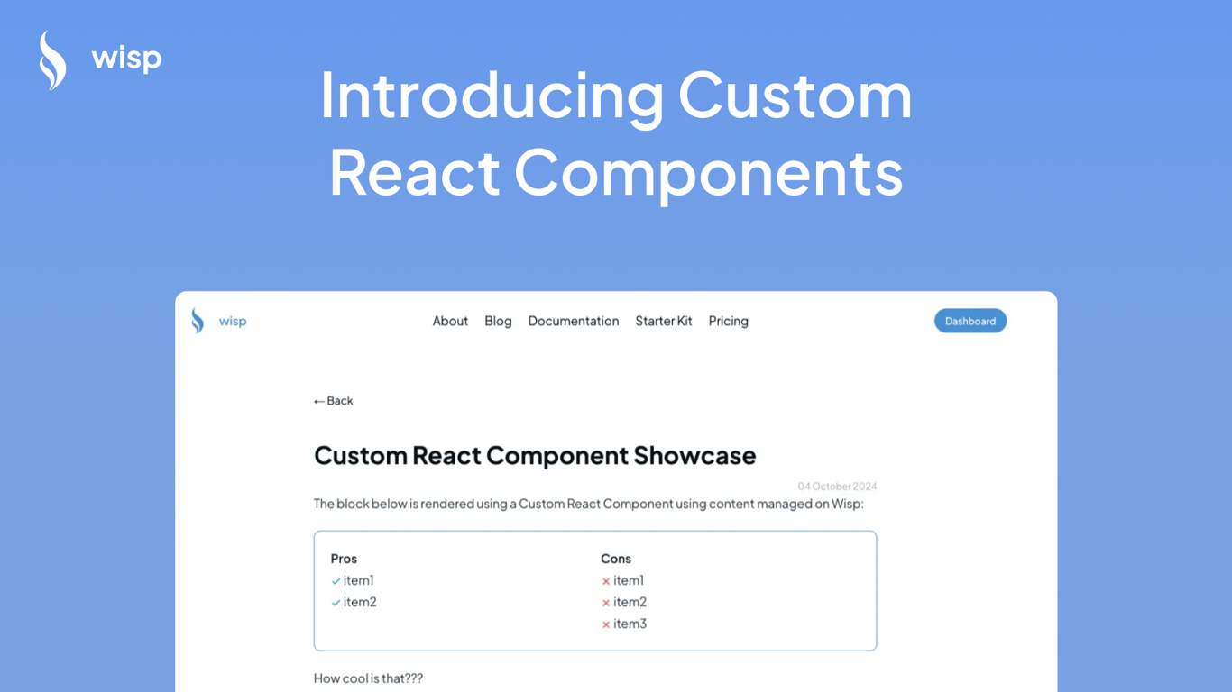
I'm thrilled to share an exciting new feature we've just rolled out at Wisp. I've been listening to your feedback, and I'm pumped to introduce custom React components for your blog posts. This is a game-changer, and I can't wait to tell you all about it!
The Content Marketer's Dilemma
As a founder, I've been in your shoes. You're crafting amazing blog content, but you're hitting a wall when it comes to making it truly interactive and engaging. You're thinking:
"How can I add an FAQ section that doesn't look like a wall of text?"
"Is there a way to insert a sleek product comparison table?"
"Can I add a newsletter signup form right in the middle of my post?"
Traditionally, content management systems (CMS) have been limited to serving static HTML and text, making it difficult to incorporate these dynamic elements seamlessly. That's where Wisp CMS is changing the game.
Wisp CMS: Pioneering Interactive Content
I'm excited to announce that WISP is one of the first headless CMSs to allow you to insert React components directly into your blog posts. Yes, you heard that right! This feature is now in beta, and it's ready for you to take it for a spin.
Here's what this means for you:
Unlimited Customization: Add any React component you can dream up, right in the middle of your content.
Interactive Elements: From FAQs to product carousels, make your blog posts come alive.
Seamless Integration: It works smoothly with your existing Next.js or React setup.
How It Works

I know you're probably thinking, "Sounds great, but is it complicated?" I've got good news – I've made it super simple. Here's the rundown:
Create Your Component: Develop your React component in your repository.
Register the Component: Use our customized renderer to register your component for use in Wisp.
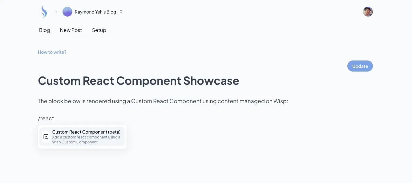
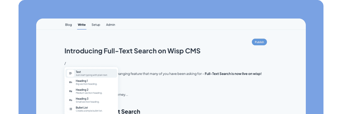
Insert and Edit: In the Wisp editor, use the slash command to insert your custom React component, specifying the component name and props.
It's that easy! No need for complex configurations or switching between multiple tools.
See It in Action
I've put together a step-by-step guide in our documentation to help you get started. But if you're more of a visual learner, I've also created a YouTube video walking you through the process.
In it, I show you how to implement both a comparison table and an FAQ section. Trust me, once you see how simple it is, you'll be itching to try it out yourself!
What's Next? Studio Mode Preview
Now, I know what some of you are thinking: "This is great, but can I preview my components before publishing?" I hear you, and I'm excited to share that we're already working on it!
Coming soon, we'll be introducing a feature similar to what other CMSs call "Studio Mode." This will allow you to see a live preview of your custom components as you're editing, without needing to publish your post. It's all about making your content creation process smoother and more intuitive.
Join the Wisp Journey
As an indie hacker myself, I'm incredibly proud of how far Wisp has come, and this new feature is just the beginning. We're committed to making content creation not just easier, but more powerful and flexible for startups and growing businesses.
P.S. If you haven't tried Wisp yet, now's the perfect time. Sign up for our free tier and see how custom React components can transform your blog content!


