A Milestone: 1,000 Blog Posts
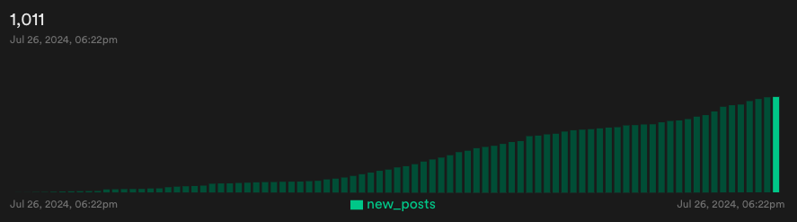
I'm thrilled to announce that Wisp has recently hit a remarkable milestone—our first 1,000 blog posts!
It has been an incredible journey, and seeing our community grow so robustly is nothing short of inspirational. But this milestone also sparked a curiosity in me:
What is everyone writing about?
What kinds of content are populating our platform?
Manual Reading vs. Embeddings
One way to get answers would be to read through all 1,000 blog posts manually. Although that might sound like an adventure, it's not exactly practical.
That's where embedding comes in. It's a neat way to visualize and cluster different types of blog posts based on their content.
I want to share the behind-the-scenes on how I leverage embeddings from OpenAI to make sense of the ton of content on wisp and at the same time show you the ecosystem of builders that are using wisp.
We will be visualising the the embeddings of all 1000 blog posts, zooming into the different clusters to see what are people writing about, and finally deep dive into the code for those of you who are looking to run a similar experiment.
Ps. This guide was first made available as a video, in the "Build with Raymond" series, but if you're the type who loves reading detailed blog posts and diving into the nitty-gritty, this article is for you.
What Are Embeddings?
First off, let's get a handle on what embeddings are.
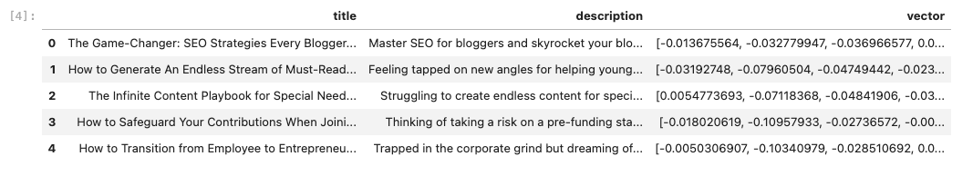
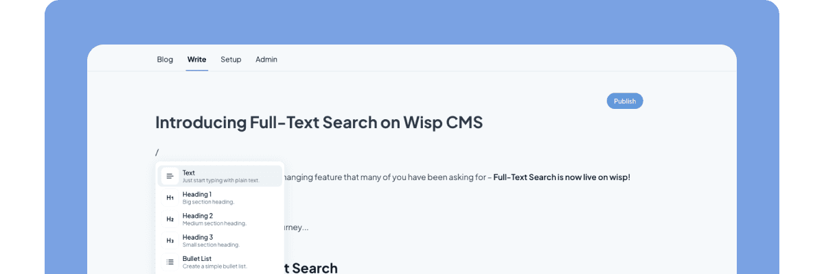
When you write a blog post on Wisp, we use OpenAI's embedding model to transform your text into a numerical representation—a string of 256 numbers, to be precise.
/
These embeddings are stored as a vector in wisp and they capture the essence of your content, enabling us to measure how related different blog posts are by comparing the distances between their embeddings.
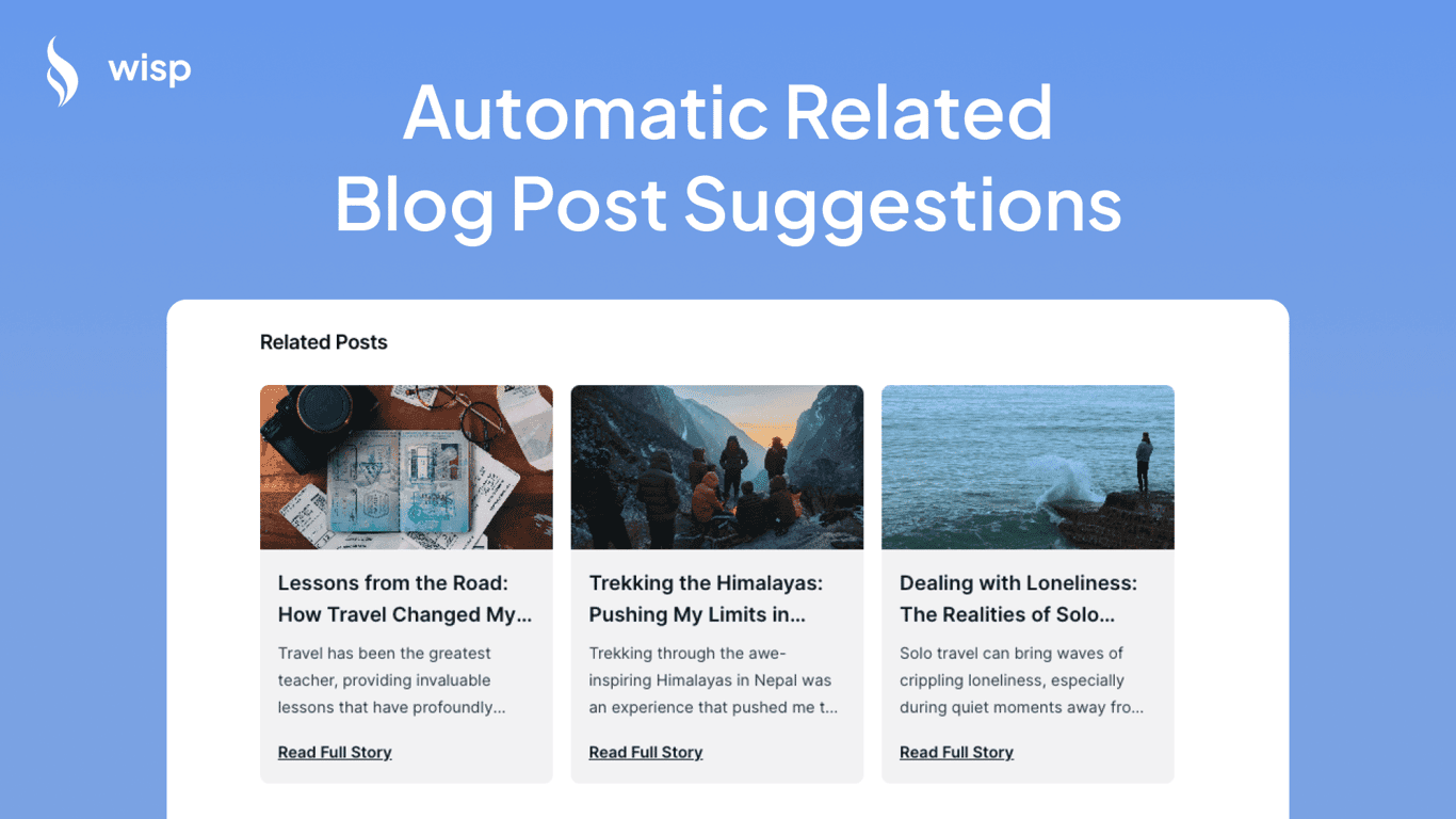
It's what we use to automatically suggest related blog post as a CMS!
Why Use Embeddings?
Embeddings offer us a powerful way to visualize and cluster blog posts, enabling us to:
Suggest related blog posts
Reveal significant content clusters
Identify popular topics and niches
Plan future features and improvements
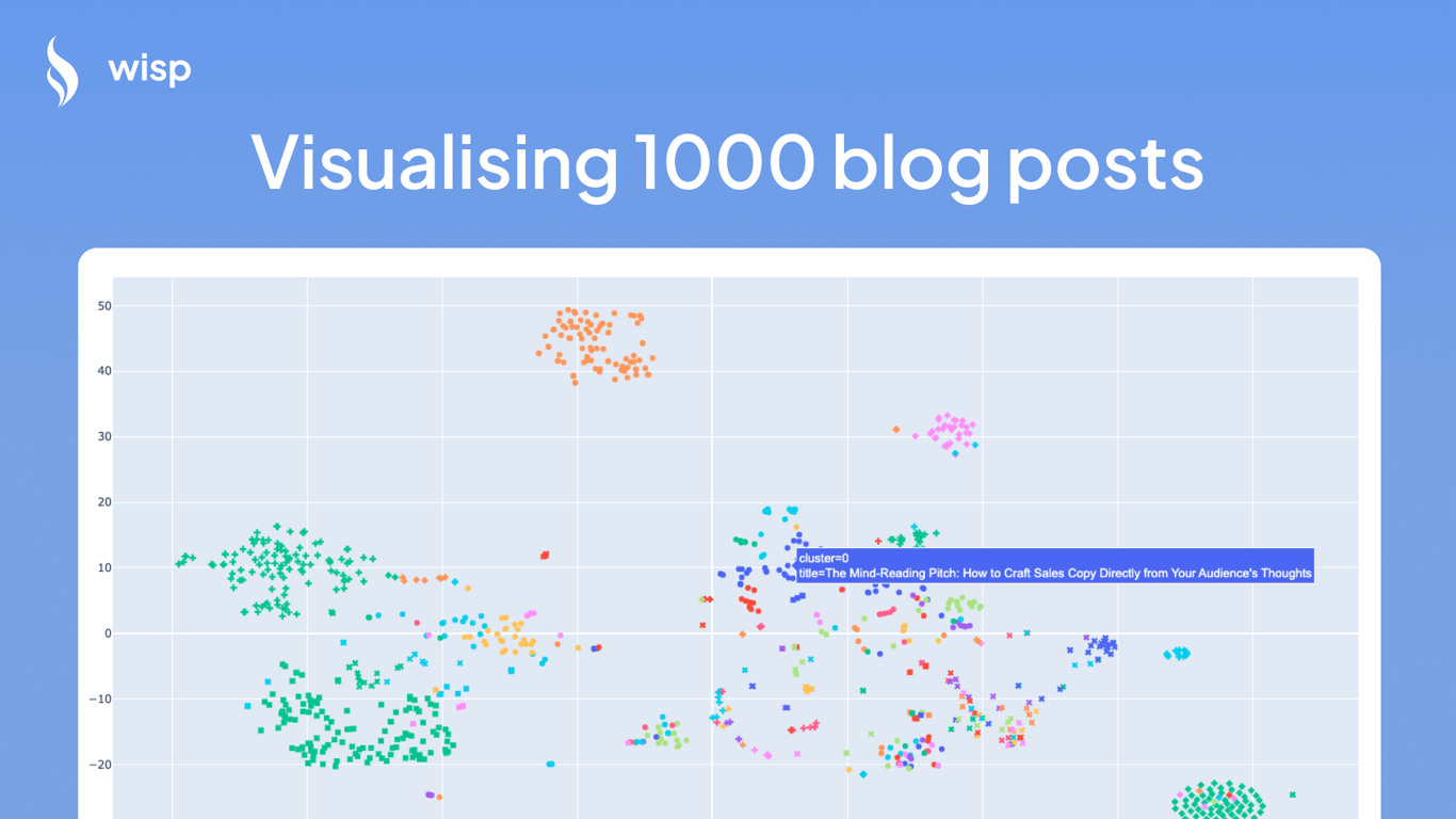
Let's take a look at how all these embedding looks like when they are visualised on a chart!
Zooming in on Interesting Clusters
By mapping out the different kinds of blogs available on Wisp, we discovered some fascinating clusters. Here's how you can interpret the scatter plot chart:
X-Y Value - The generality of the dot tells you what the content is about. Content that are semantically similar are co-located.
Color - Each color represents a different blog. There are some colors that looks similar to one another (we have >200 authors).
Shape - Different clusters, determined by the DBSCAN algorithm, are shaped differently
Here are a few highlights of the different types of blog and content in our ecosystem:
Travel Blogging
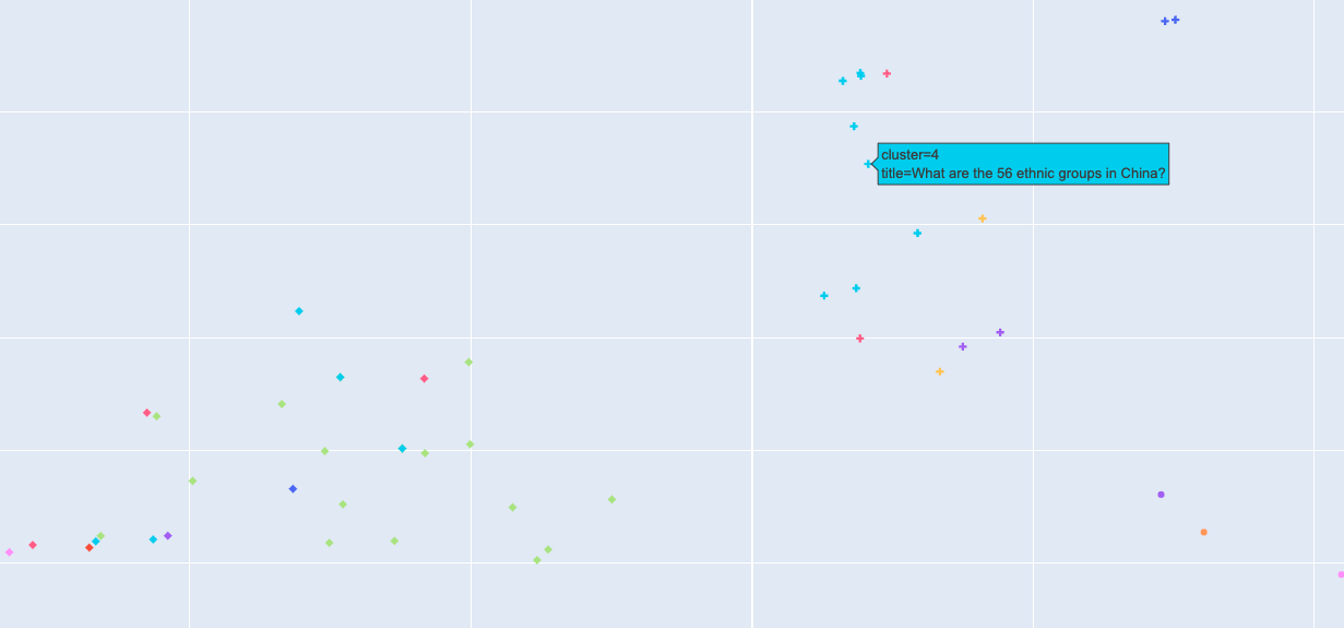
One significant cluster revolves around travel blogging. This section includes a myriad of posts, from detailed travel guides and destination reviews to personal travel diaries. Bloggers in this cluster often share tips on solo travel, hidden gems in various cities, and even photo essays from their journeys.
There are stories like:
What are the 56 ethnic groups in China?
Travel to Greece
What to do in Yunnan, China
MAIBACH Café // Pancakes and Bread (Translated from Vietnamese)
Medical and Health
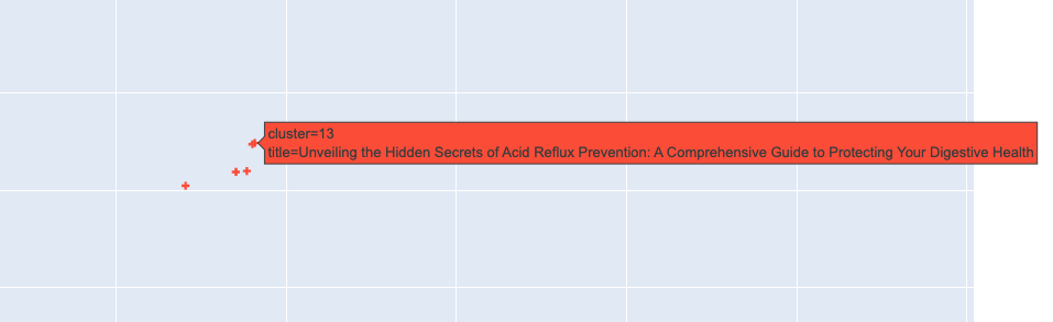
Another prominent cluster is dedicated to medical and health-related content. Topics range from detailed discussions on digestive health and wellness tips to advice on managing chronic conditions. This cluster is a treasure trove for readers interested in maintaining and improving their health through expert advice and personal stories.
Personal Journals
The personal journals cluster is full of reflective and introspective blog posts. Here, bloggers share their life experiences, challenges, and personal growth stories. It's a deeply personal space where writers connect with their audience by sharing their own journeys, making it a highly engaging and relatable section.
Marketing Strategy
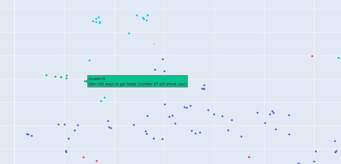
Marketing strategy is another densely populated cluster. It includes posts on growth hacking, lead generation, and optimizing landing pages. This cluster is a goldmine for startup founders and marketing directors looking to enhance their strategies and learn from experienced marketers.
Here will find posts like:
100 ways to get leads (number 87 will shock you!)
How does facebook make money?
The Power of Intentional Storytelling
Don't Just Publish Content, Use It to Unlock Industry Doors
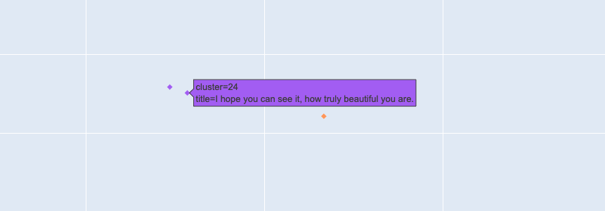
Relationships and Self-Help
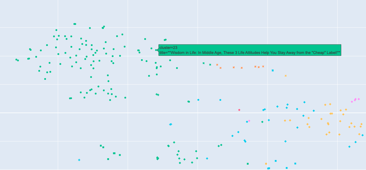
We also found a huge cluster focused on relationships and self-help. These blogs offer advice on building and maintaining relationships, self-improvement tips, and motivational posts. This area is perfect for readers looking for inspiration and practical advice to navigate various aspects of life.
You see topics around:
Wisdom in Life: In Middle Age, These 3 Life Attitudes Help You Stay Away from the "Cheap" Label
Eight Signs That a Middle-Aged Woman Is Embarking on a Period of Great Fortune
People with unstable emotions are advised to develop these three habits
Technology and Coding
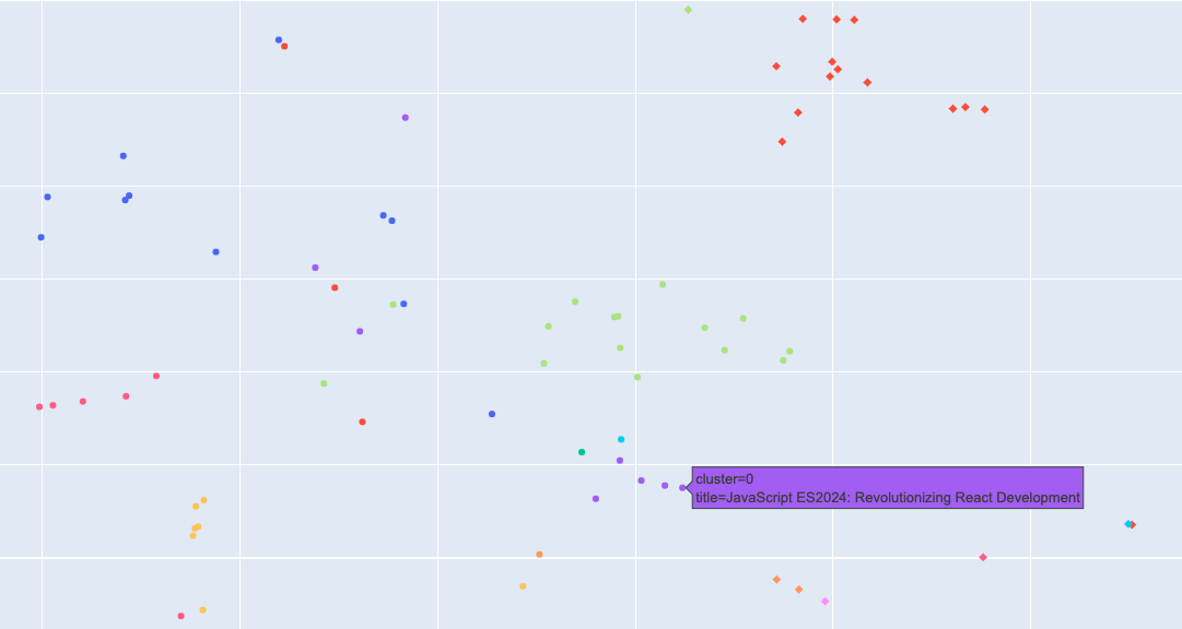
A smaller yet significant cluster pertains to technology and coding. Articles here cover programming tips, tech industry news, and reviews of the latest tools and software. This cluster is ideal for tech enthusiasts and developers who want to stay updated and enhance their skill set.
Here you will find technical articles like:
JavaScript ES2024: Revolutionizing React Development
Useful Digital Identities are Neither Decentralized nor Centralized - they are Localized
The Benefits of Using Next.js for Web Development
How To Use The Quill Rich Text Editor in Your Next.Js App Router Project
Environmental Awareness
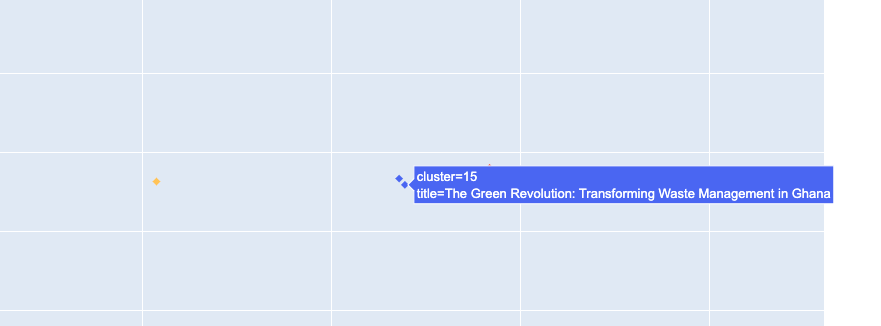
An interesting, albeit smaller, cluster is focused on environmental awareness. Blogs in this space discuss sustainable living, waste management, and other eco-friendly practices. It's a crucial area for readers interested in contributing to a greener planet.
These clusters not only highlight the diversity of content on Wisp but also underline the rich, interconnected web of knowledge and experience our users bring to the table.
Here you find interesting topics like:
The Green Revolution: Transforming Waste Management in Ghana
Environmental Awareness: Growing Up with Conservation and Sustainability
Significance and functionality of Austrian sewage treatment plants (translated from German)
The Code to Visualize Content
Here's a detailed look at how we pulled and visualized the content from our database using embeddings. The code is broken down into smaller sections for clarity.
Loading Data
First, we load data from our database and cache it locally for quicker access in subsequent runs.
import os
import pandas as pd
import sqlalchemy
from dotenv import load_dotenv
import numpy as np

# Load environment variables from .env file
load_dotenv()

# Access the DATABASE_URL environment variable
database_url = os.getenv("DATABASE_URL")

# Create a SQL Alchemy engine
engine = sqlalchemy.create_engine(database_url)

# Cache file path
cache_file = "blog_posts_cache.pkl"

# Check if cache exists
if os.path.exists(cache_file):
    # Load DataFrame from cache
    df = pd.read_pickle(cache_file)
else:
    # Example query
    query = """
    <MY DATABASE QUERY>
    """

    # Pull data into a DataFrame
    df = pd.read_sql(query, engine)
    df['vector'] = df['vector'].apply(lambda x: np.fromstring(x.strip("[]"), sep=','))

    # Cache the DataFrame to a file
    df.to_pickle(cache_file)

# Display the first few rows of the DataFrame
df.head()
Dimensionality Reduction
Embeddings are high-dimensional, which makes them hard to visualize. We use PCA for the initial dimensionality reduction to 50 dimensions.
from sklearn.decomposition import PCA

# Convert list of embeddings to a numpy array
embeddings = np.stack(df['vector'].values)

# Dimensionality reduction with PCA
pca = PCA(n_components=50)
reduced_embeddings = pca.fit_transform(embeddings)
Further Reduction with t-SNE or UMAP
We further reduce the dimensions to 2D for visualization using t-SNE or UMAP.
from sklearn.manifold import TSNE

# Further reduction with t-SNE
tsne = TSNE(n_components=2, perplexity=30)
reduced_results = tsne.fit_transform(reduced_embeddings)
Alternatively, you can use UMAP for dimensionality reduction.
from umap import UMAP

# Further reduction with UMAP
umap = UMAP(n_components=2)
reduced_results = umap.fit_transform(reduced_embeddings)t-SNE (t-Distributed Stochastic Neighbor Embedding): It emphasizes keeping similar items close together but can result in "clumpy" clusters that are sometimes hard to interpret in larger datasets.
UMAP (Uniform Manifold Approximation and Projection): It tends to preserve more of the global structure and is generally faster. The resulting clusters are more separated, which might be useful for identifying distinct categories.
Clustering with DBSCAN
We then use the DBSCAN algorithm to cluster the embeddings.
from sklearn.cluster import DBSCAN

# Clustering with DBSCAN
dbscan = DBSCAN(eps=2, min_samples=3)
df['cluster'] = dbscan.fit_predict(reduced_results)
Visualization
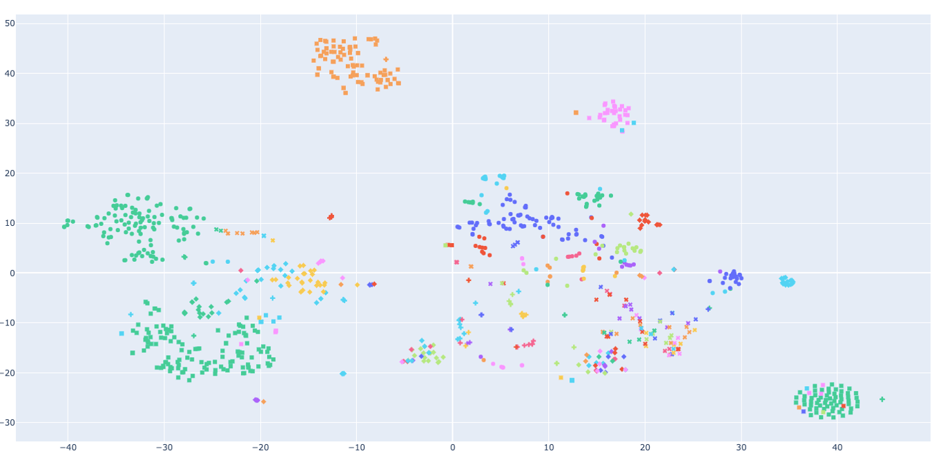
Finally, we visualize the clusters using both Matplotlib and Plotly for interactive exploration.
import matplotlib.pyplot as plt
import seaborn as sns

# Visualization using Matplotlib and Seaborn
plt.figure(figsize=(16,10))
sns.scatterplot(
    x=reduced_results[:,0], y=reduced_results[:,1],
    hue=df['teamId'], # color points by teamId
    style=df['cluster'], # different markers for clusters
    palette=sns.color_palette("hsv", len(df['teamId'].unique())),
    legend=False, # Hide the legend
    alpha=0.7
)
plt.show()

num_clusters = len(np.unique(df['cluster'][df['cluster'] != -1]))
print(f"Number of clusters (excluding noise): {num_clusters}")
import plotly.express as px
from plotly.offline import init_notebook_mode
init_notebook_mode()
# Create a DataFrame for the t-SNE results
reduced_df = pd.DataFrame(reduced_results, columns=['x', 'y'])
reduced_df['teamId'] = df['teamId']
reduced_df['cluster'] = df['cluster']
reduced_df['title'] = df['title'] # Add the title for hover information
# Plot using Plotly Express
fig = px.scatter(reduced_df, x='x', y='y',
color='teamId', # color points by teamId
symbol='cluster', # different markers for clusters
hover_data={'title': True, # explicitly show blog title
'cluster': True, # explicitly show cluster ID
'teamId': False, # do not show teamId
'x': False, # do not show x coordinate
'y': False, # do not show y coordinate
},
title='Blog Posts Visualization',
color_continuous_scale=px.colors.sequential.Viridis,
height=800)
fig.update_layout(showlegend=False) # Hide the legend
fig.show()Feel free to experiment with both t-SNE and UMAP to see which visualization fits your needs best. Both techniques have their advantages and can provide valuable insights into the structure and relationships within your data.
Future Plans
Leveraging embeddings and AI technologies has opened up a ton of possibilities for future development on Wisp. Here are a few exciting features and improvements we have in the pipeline:
Contextualized Call to Actions (CTAs)
We aim to implement more intelligent and contextualized CTAs, tailored to the content users are reading. For example, a blog post on content distribution could prompt a CTA related to social media integration tools within Wisp, making CTAs more relevant and actionable.
Enhanced Content Recommendations
By refining our embedding and clustering techniques, we plan to offer even more precise content recommendations. Whether it's blog-to-blog linking or suggesting relevant articles to readers, our goal is to create a more interconnected and intuitive user experience.
Monetization and Collaboration Opportunities
With the ability to visualize content clusters and relationships, we can facilitate better collaboration among bloggers. Additionally, we see potential in linking advertisers with bloggers whose content aligns with their target audience, thereby creating new monetization opportunities.
Conclusion
And that’s how we visualize and cluster 1,000 blog posts using OpenAI embeddings!
This process not only reveals patterns and trends within our content but also opens up exciting new possibilities for future features and improvements.
Thank you for joining me on this AI-powered journey through Wisp. If you are interested in content like this, make sure to subscribe to our newsletter or our "Build with Raymond" youtube playlist where I take you on deep dives in the technologies behind wisp.