Today, I’m thrilled to share the process behind a critical makeover I've just completed for Wisp's landing page. It’s something I’ve been eager to tackle for quite a while, and I’m excited to take you through the journey of transforming it into a conversion powerhouse.
The Problem with the Old Landing Page
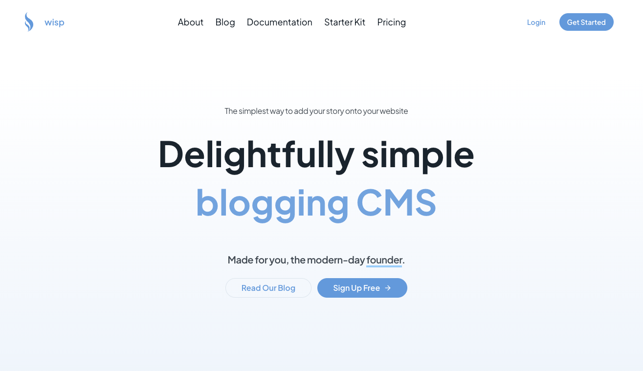
For the longest time, I had been receiving feedback indicating that my landing page for Wisp was not effective. Both developers and startup CEOs were not immediately understanding the core value of the product. Let me paint you a picture.
Imagine landing on a page with vague phrases like “Make for you the modern day founder” That’s how my old landing page began. It then dove straight into talking about a “first-class editorial experience,” leaving visitors scratching their heads. Developers couldn’t grasp what the product offered, and startup CEOs couldn’t see how it would fit into their business needs.
The primary issues with the old landing page included:
Unclear Messaging: The language was convoluted and did not clearly articulate the product's value proposition. It left visitors asking, “What is this about?”
Lack of Targeted Communication: There was no specificity tailored to the distinct needs of developers or startup CEOs. It felt like a generic pitch rather than a targeted solution.
Low Conversion Metrics: Data from website analytics showed a significant drop-off at the landing page. Visitors were not converting into users because the page failed to captivate and communicate effectively.
The messaging wasn’t just off—it was a barrier. The initial assumption behind the old landing page was that people, already familiar with various headless CMS options, would appreciate a first-class editorial experience. However, real-world feedback and visitor data revealed a starkly different reality. Users didn’t know what they were getting into, resulting in one of the lowest converting touchpoints on the website.
Revamping the Approach
With this valuable data in hand, I knew it was time for a major overhaul. The primary goal was to create a landing page that would:
Directly Speak to Developers: Shifting the focus to developers was crucial. Initially, the landing page tried to speak to everyone, which meant it resonated with no one. By honing in on the specific needs and frustrations of developers, the new page communicates directly and effectively to the target audience.
Clearly Communicate the Value Proposition: The messaging needed to convey the benefits rather than just features. Instead of listing what Wisp can do, the new page paints a picture of the positive outcomes for users, showcasing how Wisp alleviates their pain points and makes their lives easier.
Rub Salt on the Wound: Highlight the pitfalls of the DIY approach to agitate the problem and show why Wisp is the better solution. This emphasizes how trying to build a custom blog solution can be a huge time sink, leading to distraction and inefficiency, thereby driving home the importance of using a specialized product like Wisp.
Step-by-Step Breakdown of the New Landing Page
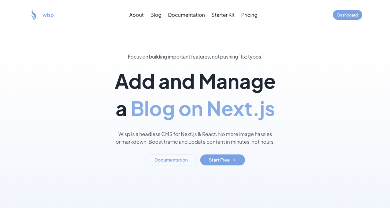
Focusing on the Audience
One of the critical changes made was shifting the focus to speak directly to developers. Initially, the landing page had a broad message that failed to strike a chord with a specific audience. I realized that speaking to everyone meant resonating with no one. So, the new landing page was crafted with a developer-first approach.
Clear Value Proposition
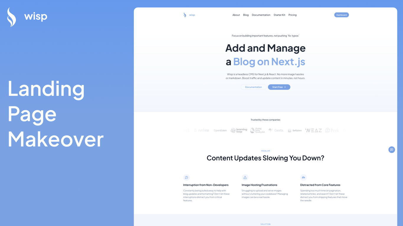
The next significant change was the value proposition of the landing page. The new headline is concise and clear: “Add and manage blogs on Next.js.” In just a few words, it tells the developer exactly what Wisp provides. The message was aligned with typical developer challenges—such as fixing typos and handling content updates.
Having fix: typos in the sub-header also helps build rapports with developers as they can immediately connect to their own experience trying to update content on their site.
Custom-Tailored Messaging
Understanding the pain points of the target audience was crucial. From dealing with image hosting to the frustration of integrating content without disrupting the core development focus, the new page addresses these issues head-on. It communicates that Wisp can simplify these tasks, allowing developers to focus on more critical features.
Agitating the Problem – Rubbing Salt on the Wound
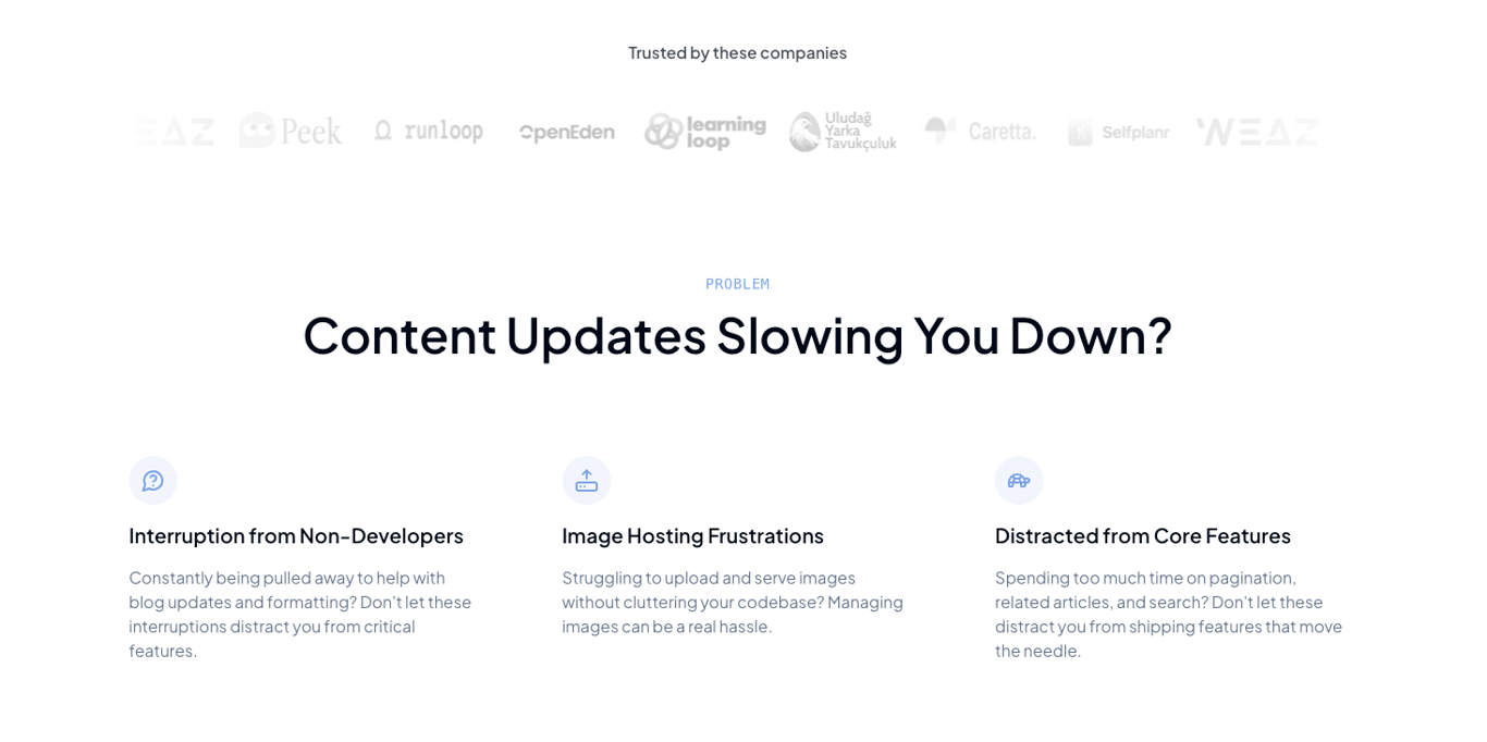
To make the problem even more compelling, I leaned into the frustration developers feel when they try to build solutions themselves. Here's where we "rub salt on the wound."
Imagine the scenario: you decide to DIY your blog integration. What begins as a small task snowballs into an unexpected time sink. You aim to integrate and deploy within a week, but things rarely go as planned. Bugs appear, integrations falter, and suddenly, what seemed manageable takes weeks. All this while pulling you away from more important, revenue-generating tasks. You're stuck fixing typos and handling content issues instead of building that killer feature or closing that crucial client deal. The distraction and wasted effort add up, leaving you frustrated and behind schedule.
By juxtaposing the ease of using Wisp against the inherent pitfalls of a DIY approach, the landing page makes a strong case for why developers should opt for Wisp. This tactic of agitating the problem before presenting the solution emphasizes the value and urgency of using a specialized product like Wisp.
Social Proof
Another essential element added was social proof. Before, there were no showcasing logos or success stories. Now, the landing page features logos of real companies that use Wisp, adding an element of trust and validation. People are more likely to believe in the product when they see others benefiting from it.
Solution Presentation
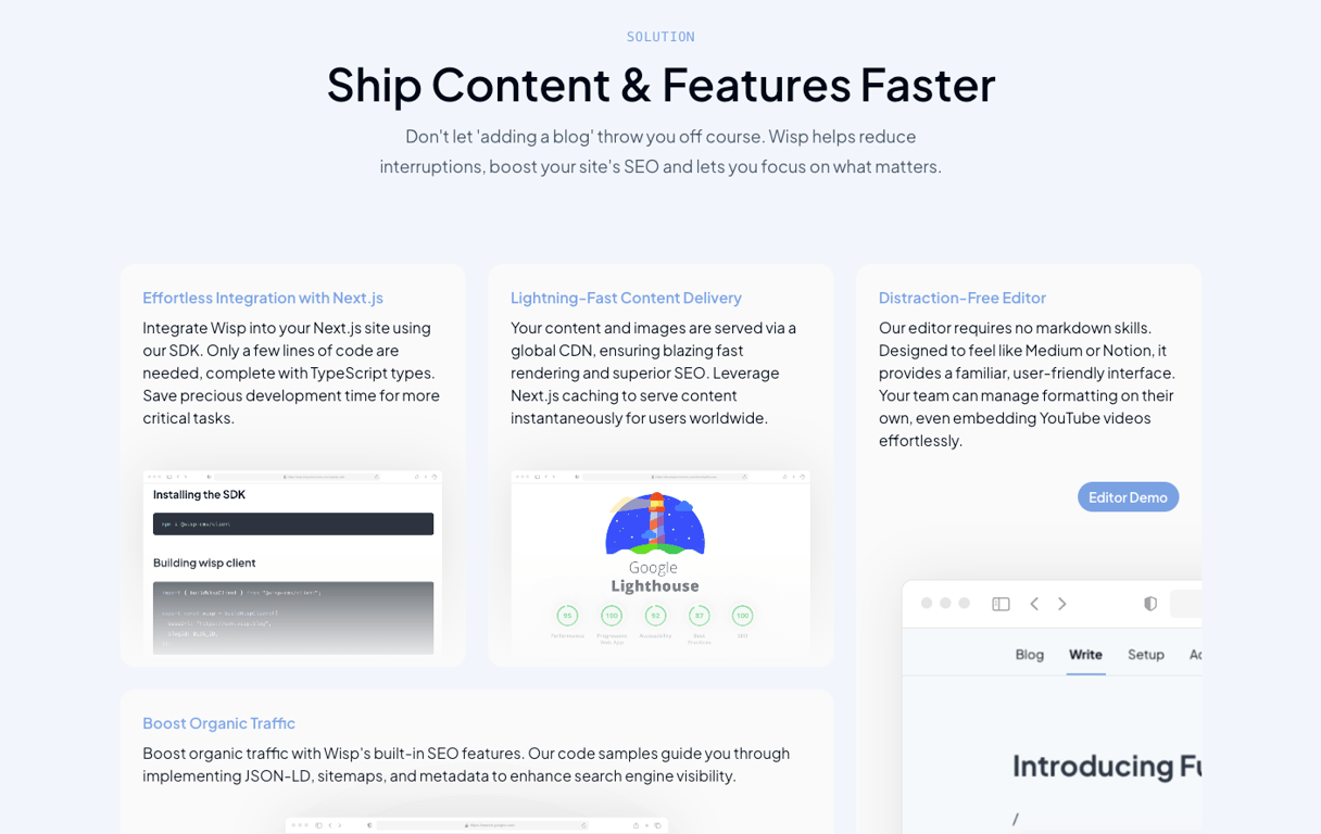
A significant part of the new structure involves agitating the problem and then presenting Wisp as the solution. This method hooks the reader by first resonating with their frustrations:
Content updates that slow down the workflow.
Non-developers causing interruptions.
The distraction from shipping core features due to managing blogs.
Once these pain points are laid out, the solution provided by Wisp is clearly articulated:
Ship content fast without losing development hours.
Reduce interruptions and boost site SEO.
Focus on what truly matters rather than being bogged down by blog maintenance.
Streamlined Conversion Pathway
The new landing page ends with a very clear and straightforward pathway for conversion. Here’s the simplified three-step process:
Sign Up: Get started with Wisp easily. Write your first blog post right after signing up.
Set Up: Follow intuitive setup instructions built into the app.
Launch: Begin benefiting from a seamless blogging experience.
Each of these steps is designed to guide the user efficiently from interest to action.
Lessons Learned and Resources Used
Rebuilding the landing page wasn’t just about design and text tweaks. I delved into several resources to understand best practices and optimize effectiveness.
Essential Resources:
Fletch PMM: Provided invaluable before-and-after examples of high-converting landing pages, guiding much of the restructuring.
Magic UI: Offered SaaS templates that saved hours in design and ensured the elements were modern and user-friendly.
Anatomy of High Converting Landing Pages: Gave a detailed breakdown of effective landing page elements, which I incorporated into WISP’s page.
Katie Dill’s Landing Page Reviews: Insights into above-the-fold information, problem agitation, and streamlined call-to-actions were crucial in shaping the new design.
By focusing on targeted, clear messaging and leveraging these proven design principles, the updated WISP landing page is now primed to convert visitors into active users effectively.
I invite you to check out the new landing page for yourself and share your thoughts. Has it become more compelling, especially if you are a developer? Your feedback will be invaluable as we continue refining and enhancing the user experience.
Stay tuned for more updates, and thank you for being part of this journey!
